Bad Typography Around Me


Hello everyone!
The typography of one kind or another is all around us, and that’s why bad typography is everywhere. But to be honest, bad typography is irritating and in some cases, it's very confusing. So here are 3 bad typography examples around me that makes me so confused with these three products.
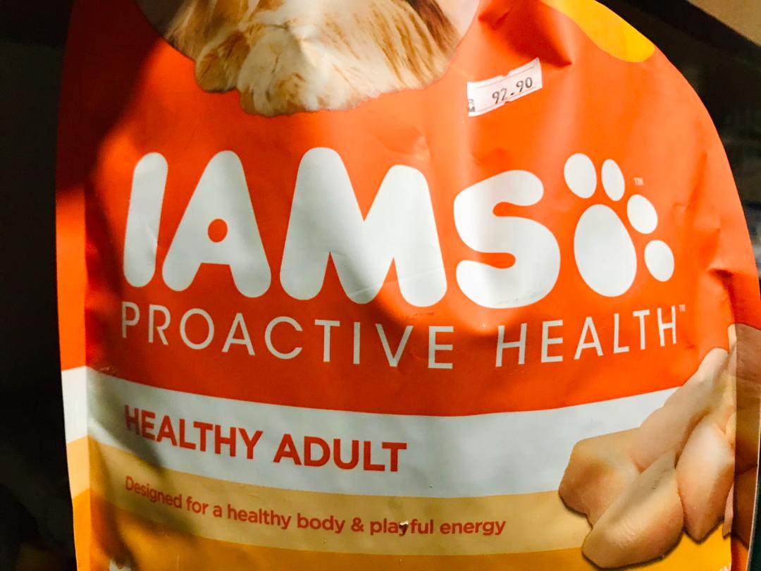
The first product that I choose is IAMS. The reason why I choose this IAMS cat food is that it makes me confused about how I should pronounce the name because at first, I pronounce "IAMSO". The cat's paw beside the "S" actually seems like "O" because of the size and the color of typography is the same. But for me, I think some people who don't know about the name of this product will automatically confuse either it is IAMS OR IAMSO.
The second product is SMART KEYLER, which is an insect organic spray. In my opinion, the typography "KEYLER" is not suitable for this product because why not just put "KILLER" instead of "KEY". This is because people will think about what is the use of the products because the name plays an important role in one product
The third one is the EAST LANDS hand sanitizer. The first thing that pops out in my mind when I looked at this product is "it's that a toner?" or "what is this? Lotion?". The packaging itself is really confusing and it doesn't look like hand sanitizer at all. But, just forget about packaging. The typeface is really unsuitable for medical products and it is not formal typography for hand sanitizer. The typography of medical products should be BOLD and FORMAL.
For example:

That all for today.
M.


Comments
Post a Comment