Posts

Showing posts from April, 2020

Assignment: Final Font Poster

Image
So here is the final design for my font poster assignment by using my nickname which is "ECAH" I choose Poppins Bold typeface on this poster. Technically, it is one of Geometric Sans Serif typefaces, and the reason why I choose this font is that it has a simple and modern look but it can fit in with various kinds of designs. As we can see, I used three combinations of colors that are dark blue, turquoise, and cream. I tried to mix more than 5 combinations on this poster before I finalize to choose this one, but yeah this color wins my heart!  I try to make this poster as minimal as I can but still, it has elements of design on this poster which are color, contrast, line, shape, and also size.    

Font Poster

Image
Hello there! So, here we can see the picture above is a poster of Helvetica font. Helvetica is one of the most popular typefaces in the world. Technically speaking, it’s a sans serif typeface, inspired by and based on the Akzidenz-Grotesk typeface created by Berthold around 1898 but the original Helvetica was designed in Switzerland in 1957 by Max Miedinger and Eduard Hoffmann. The reason why I love this font is that we see it hundreds of times a day, ranging from product labels to blogs to advertising, posters and many other products. However, in practical terms, it is used by designers from all over the world at small companies, large businesses and all in between. For instance, we can see famous brands such as BMW, PANASONIC, ORAL-B, TOYOTA, NESTLE and many more are using this Helvetica font for their logos. We know that Helvetica  is a sans serif font, that has a simple and modern look but it can fit in with various kinds of designs. In my opinion,  Helv...

Bad Typography Around Me

Image
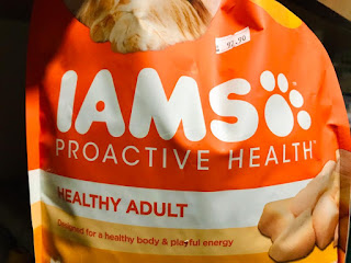
Hello everyone!   The typography of one kind or another is all around us, and that’s why bad typography is everywhere. But to be honest, bad typography is irritating and in some cases, it's very confusing. So here are 3 bad typography examples around me that makes me so confused with these three products. The first product that I choose is  IAMS . The reason why I choose this IAMS cat food is that it makes me confused about how I should pronounce the name because at first, I pronounce "IAMSO". The cat's paw beside the "S" actually seems like "O" because of the size and the color of typography is the same. But for me, I think some people who  don't know about the name of this product will automatically confuse either it is IAMS OR IAMSO.   The second product is SMART KEYLER ,  which is an insect organic spray. In my opinion, the typography "KEYLER" is not suitable for this product because why not just put ...